




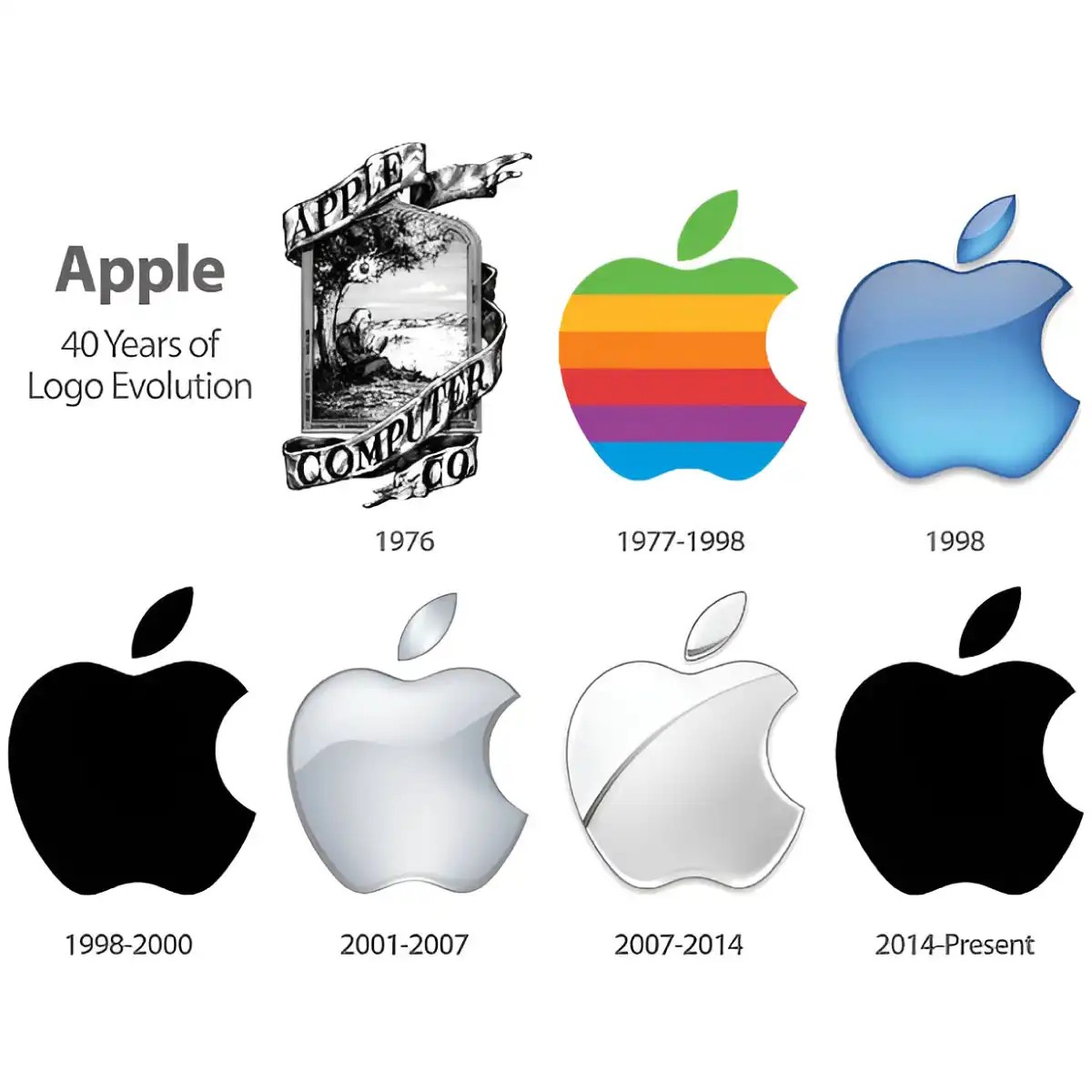
How the #Apple logo evolved: From Isaac Newton to Bite
Logos are rarely just graphics. A visual anchor. For decades, brands have used these symbols to instill a certain image in the minds of consumers. Logos is not silent. they have changed. they are constantly evolving. These changes reflect important milestones in the company’s history and help people connect with the brand. We take a look at ten globally recognized icons and explore how they’ve changed and why. Let’s start with the most valuable brand on the planet.
Apple logo change: from a detailed image to a simple icon
The story of the Apple logo is a study in simplicity. It didn’t look like the smooth, monochrome apple we recognize today. The original design was complex. It depicts Isaac Newton sitting under an apple tree. The logo contains the text surrounding the illustration. It was literal. It was busy. That was in 1977.
The designers wanted to express the spirit of knowledge and discovery. Newton represented the curiosity that drives innovation. But the design was cluttered. It doesn’t scale well. As Apple grew, the logo had to become more versatile. It needed to work on tiny business cards and massive billboards.
“Logos should be simple. Even if they are the size of a grain of rice, they should be recognizable.”
The transition from Newton’s diagram did not happen immediately. It happened in stages. The first major change removed the text. It kept the colored stripes. Steve Jobs was not originally a fan of rainbow designs. He likes simplicity. He wanted the logo to be solid. However, the marketing team believes that color represents diversity and creativity. they won. Over the years, the rainbow apple has become an iconic.
But even the Striped Apple has become too detailed for the digital age. As screens get sharper and user interfaces become more minimalistic, complex shadows and stripes feel outdated. All the brand’s products aim for a cleaner aesthetic. The logo needed to follow.
In 2001, the logo became flatter. The stripes disappeared. The apple was a single color. It was a subtle change, but it marked a shift towards modernism. A logo is no longer just a symbol of a computer company. It is becoming a lifestyle brand.
The last major change took place in 2007. The logo lost its shading entirely. It became a flat, solid color. All extraneous details have been removed. The bite mark remained. The leaf remained. But the complexity is gone. This version is the one we are currently seeing. It is clean. It is unmistakable. This is the result of decades of refinement.
Why is this happening? The market has changed. Consumers expect simplicity. Technology advanced. The logo should reflect the accuracy of the product inside the box. Newton’s illustrations honor the past. A flat apple represents the present.
The change is not only about aesthetics. This is strategic. This shows that Apple is no longer just a computer manufacturer. It was a design house. This is a cultural force. The logo evolved to match the brand’s expanding influence.
The current logo is minimal. It is based on negative space. It uses the bite mark not only as visual elements but also as functional elements. It separates apples from cherries or plums. This is genius graphic design. This too
The evolution of the #Apple logo: from Newton to minimalism
Apple’s visual identity begins with a level of historical detail that seems almost laughable today. The original logo depicts Isaac Newton sitting under an apple tree, a direct homage to the theory of gravitation. While this is detailed and descriptive, it is completely impractical in the small space required to keep a technical logo alive.
2. Apple logo shift
Apple’s brand story changed dramatically in 1977. The company has abandoned complex illustration for the rainbow-colored apple with a bite taken out of it. This design choice is not just aesthetic. This is a strategic move to align the brand with the PC revolution driven by personality and creativity. The rainbow stripes were designed to reflect the characteristics of the Apple II, one of the first personal computers capable of displaying color graphics.
In the following decades, the logo went through several simplifications. The thick black outline is removed. The rainbow gradient is flattened into a single color. The goal is clarity. In a world where screen sizes are shrinking and digital consumption is growing rapidly, complex images become noise.
The reduction of the logo is a step towards universal recognition, removing the context until only the form remains.
The current logo is a simple, monochromatic silhouette. The narrative connection to Isaac Newton and the technical promise of color is lost. What remains is a form that is instantly recognizable regardless of language or culture. This minimalism is a double-edged sword. While this offers incredible scalability, it risks losing the special history that once defined the brand’s rebellious spirit.
Why would they want to get rid of the bite? Some believe this is for legal reasons, while others believe it is to prevent the symbols from being confused with cherries or cookies. The truth is less dramatic. It’s all about consistency. The bite marks form a unique outline that distinguishes apples from other fruits and ensures that logos are recognizable at first glance or even when printed at low resolution.
The transition from Newton’s tree to flat, monochrome icons reflects a broader corporate change at Apple. They went from a niche computer manufacturer serving artists and researchers to a global consumer electronics giant. The logo had to be changed to adapt to a market that values speed, simplicity and a instant association over deep historical context.
Is the current minimalist approach better? It really helps brand awareness. But it also stripped away the storytelling that once made the brand feel like a rebellion against IBM’s corporate gray. Now, it is simply the apple.
McDonald’s: How a font change created a global brand
Most people think of the golden arches as the face of McDonald’s. They aren’t. For decades, logos had only a supporting role. The real star of the 1950s and 1960s was typography.
The original cursive font is very familiar. It feels like a sign. But in the late 1960s, the brand needed to expand. Handwritten scripts are not well suited to different media and international markets. Consistency is lacking.
Rob Janoff appears. In 1968, he designed the Golden Arches logo. It’s minimalistic. Geometric. Bold.
But here’s the twist. the arches didn’t replace the name. They sat above it. Before 2003, the logo looked like this:
McDonald’s (with specific font)
||
(Golden Arches)
The wordmark font is Speedy. It was custom-made for the brand. thick. round. Easy to read even from a distance. It worked. It has worked well for 35 years.
So why the change?
In 2003, McDonald’s updated its logo. They have not abandoned the arch. They didn’t even throw out the name. They changed the font.
The new font is simpler. cleaner. Speedy’s signature lines and curves have been removed. It became more generic. More corporate. The arch is still there, but its size has increased. The word mark is now smaller. The relationship has reversed. The symbol became dominant. The name became secondary.
Is it necessary?
According to some designers, it weakens the personality of the brand. The old logo had a human touch. The new one feels like a machine. But McDonald’s doesn’t sell personality. They sell efficiency. Global consistency. A seamless experience from Tokyo to Toronto.
The changes in 2003 were in line with the wider brand transition. Logos are increasingly focused on digital readability rather than decoration. The screen is small. Mobile app. Favicon recognition. Speedy’s rounded bold font does not translate well to smaller pixel sizes. The new font does just that.
Have your sales skyrocketed?
You can never tell. Logo changes cannot be separated from menu changes and marketing campaigns. But the brand has become even better known as a symbol. The arches alone are enough. Try showing a child just the two yellow bars on a red background. they know what it is.
The current logo has been improved in recent years, keeping the 2003 design, but with more white space. The arch is slightly curved. Red is darker. The font is also simplified.
This is a Brand Evolution study. Start with something unique. Scale it up. Simplify it. It sacrifices character for clarity.
Is this a loss? Or a gain?
Depends on who you ask. The designers miss the quirks. The executives love the efficiency.
The arch still exists. The name remained. But the font? Now they are just words.
Evolution of #McDonald’s and Nike logos
McDonald’s didn’t start with the iconic golden arches. The original product image was a character named Speedee, a cheerful red-haired chef wearing a hat. This mascot was an early staple of the fast food giant. However, the brand needed a faster reading speed that would allow it to read on roadside signs at higher speeds.
The solution is the Golden Arches. These two yellow arches are more than just decorative lines. These come from the actual buildings of the company’s early restaurants. The structure itself has a visible A-frame roof. The logo also reflects this model. This becomes a visual abbreviation of the menu itself. For many years, the logo has depicted its flagship products: hamburgers and fries. This is what it literally means. directly.
That clutter is gone. The modern McDonald’s logo is truly minimalistic. It strips away the food imagery and the mascot. All that remains is the double arches and the word “McDonald’s”. This shift reflects a broader corporate identity trend: from descriptive complexity to scalable simplicity. You can recognize it even from a distance. You don’t need to look at a burger to know what you’re eating.
4. Changing the Nike logo
Unlike McDonald’s, which evolved from a character to an abstract form, Nike’s logo changes to refine an abstract concept. When the brand was founded as Blue Ribbon Sports, it didn’t necessarily have the Swoosh logo. They rely on text-based logos and simple graphics, but they don’t fully describe the movement of the product.
The current logo, known simply as the “Swoosh”, was designed in 1971 by graphic design student Carolyn Davidson. This is not the result of decades of evolution. This is a simple assignment. Davidson’s design fee is only $35. While that amount of money seems crazy now, the return on investment was astronomical.
The Swoosh represents movement. speed. The wings of the Greek goddess Nike. This is not a literal description of the shoe. This is not a picture of an athlete. This is a dynamic curve that shows forward momentum. The power of a logo lies in its ambiguity. It doesn’t tell you what the product is. It tells you how the product feels to use.
For a long time, the logo was small. It is usually placed on the side of a shoebox or on the heel of a sneaker. As the brand grew, so did the Swoosh’s profile. It became the center of attention. It became a symbol not only of athletic performance but also of cultural superiority. The design has not changed. Its placement did. Its perception did.
This kind of minimalism involves compromises. Certain data will be lost. Increase brand awareness. You end up sacrificing clarity for universality. The Nike logo works because it’s not about getting attention. It just exists. Stamp of approval. A mark of speed.
Why minimalism wins in a fast-paced market
Both McDonald’s and Nike are going in the direction of simplicity. But their reasons are different. McDonald’s needs to communicate quickly with drivers. Nike needs to convey emotions to consumers. The end result is the same: a logo that is easy to remember and copy.
The transition from detailed images to simple shapes is not just for aesthetics. This is very practical. Simple logos scale better on digital screens. They print cleaner on their uniforms.
The Evolution of #CorporateLogos: From Nike’s Letters to Google’s Simplification
Nike’s visual identity didn’t start with the iconic checkmark. The original brand logo was a combination of the letters “NI” and “KE”. That typographic arrangement was short-lived. It was replaced in 1971 by the Swoosh designed by Carolyn Davidson. The Swoosh is an integral part of Nike’s brand identity. Today, the company still uses the same curved shape as its main logo. The transition from text to abstract symbols is a key moment in the way sportswear brands communicate their values.
5. Google Logo Change: Moving to Minimalism
Google has gone through several logo changes since its inception, the most recent significant change occurring in 2015. The company has ditched the colorful, serifed, multi-colored letters that defined its look for nearly 20 years. The new logo developed by Pentagram features a cleaner sans-serif font called Product Sans.
This change is subtle, but well thought out. Google has removed serifs, which are small decorative lines at the end of letters. This makes text clearer on digital screens of all sizes. The new font design is neutral and adaptable. Works better on mobile devices, smartwatches and large billboards than previous versions.
Why did Google make The change? The answer lies in simplicity. As Google expands into hardware, smart home devices, and artificial intelligence, complex logos are increasingly difficult to scale. The old logo looked like a mess of small icons. The new one stands out clearly in all situations.
The color palette has also developed. Google kept the four primary colors of blue, red, yellow and green, but changed the tone to increase contrast and consistency. The new logo feels more modern and less tied to a specific era of web design. This shows that Google is no longer just a search engine. This is a technology ecosystem.
This redesign is in line with broader corporate branding trends. Companies are moving towards minimalism. Why? A minimal logo is easier to find in a crowded digital environment. They reduce the cognitive load. They will do better in a world where attention spans continue to shrink.
Google’s logo change isn’t just about aesthetics. It is very practical. This reflects the company’s transition from a single product to a service package. The new logo is very flexible. It can be animated, scaled and integrated into many different platforms without losing its core features.
Is minimalism always the right choice? Not necessarily. Some brands thrive through complexity. But for Google, simplicity is the goal. With the new logo, there are no more distractions. The main focus is on clarity. It works because it doesn’t try to do everything at once.
The effect was immediate. Users noticed the change and quickly adapted. The new logo didn’t confuse anyone. It felt familiar, but fresh. A reminder that even the most famous brands can evolve without losing their essence.
What does The mean for other companies? This shows that logos should have a purpose other than decoration. They are supposed to work in the real world. They have to adapt to new technology. Although it looks modern, it should be timeless.
Google’s logo change is part of a broader discussion about branding in the digital age. It’s not just about looking good. It’s about functioning well. It’s about being useful.
The
The beverage giant’s visual identity follows a similar path of simplification. It starts with “Google!” including an exclamation mark. Then, a background color was added behind the word “Google.” Over the following years, the logo became increasingly minimal, culminating in its current version, which contains only the word “Google” with no additional embellishments.
6. Evolution of the Pepsi-Cola logo
The story of Pepsi’s logo change is not a sudden reinvention but a slow and deliberate loss of complexity. Like many traditional brands, Pepsi has spent decades trying to cut through the visual noise to maintain its presence in a crowded market. The original logo, introduced in the early 20th century, was even more ornate. It featured complex typography and a frequently changing color palette, often featuring a patriotic red, white and blue color scheme to appeal to American sensibilities during the World Wars.
In the 1950s and 1960s, logos began to be simplified. The curved, script-like font has been replaced with a bolder sans-serif font that’s easier to read at speed and on smaller packaging. It’s not just an aesthetic choice. it was a functional one. As TV ads replace print ads, logos need to be recognized within seconds. The iconic red, white and blue swirl Pepsi Globe only appeared in 1973. Before that, the brand relied almost entirely on its name.
The appearance of the globe meant a significant change. It transformed the logo from a wordmark into a symbol. The swirls are designed to mimic the movement of a refreshing drink, evoking energy and movement. Yet, even this design has not been static. In 1991, Pepsi tried to reinvent itself and launched a minimalist, angular globe that looked more like a tech company than a soda brand. The public’s reaction was mixed, to say the least. Sales dipped. The brand panicked. After only a year, they realized that customers were combining the classic shape with their favorite flavors and returned to the original swirl shape.
This iteration highlights the tension at the heart of the rebranding strategy. It’s all about how much you can change before you alienate your core audience. For Pepsi, the answer has consistently been “not much.” Recent iterations of the logo, particularly the 2008 and 2014 updates, have focused on refining the globe rather than replacing it. The colors are now brighter. The lines are smooth. The typography is clearer. But the essence remains.
Why is this important for financial decisions? Because logo evolution is a direct reflection of the company’s strategy and market position. A dramatic logo change often signifies a change in business model, a merger, or a desperate attempt to appeal to a younger audience. When a brand like Pepsi pulls back from a radical redesign, it’s a sign of stability. They calculated the risk of losing brand equity and chosen caution over innovation.
Consider trade-offs. A minimalist logo, like the current Pepsi design, is scalable. It works on a smartphone app icon just as well as it does on a stadium billboard. It reduces printing costs. This is in line with the global trend of flat design. However, it also risks blending in. When any brand uses clean lines or sans-serif fonts, it loses its uniqueness.
7. Amazon logo change
Amazon’s early identity was based on a typeface that represented its original name, “Brad’s Drink.” The brand eventually switched to its own red and blue color scheme. Today, the logo is stripped back and only the brand is visible.
Arrow from A to Z
Amazon’s visual identity is a master class in information hiding. The current logo is deceptively simple. A black serif font sits above a curved yellow line. That curve is more than just a smile. This is an arrow.
The arrow starts below the letter “a”. Ends with the letter “z”.
This design choice was well thought out. This means everything the company sells from start to finish. This is the visual promise of unlimited inventory. The yellow curve also looks like a smile. This tells about customer satisfaction. However, the biggest feature is the inventory selection.
Jeff Bezos founded Amazon in 1994. The original logo was different. It featured a more traditional serif typeface. There are no arrows. The rebranding came rather late.
The update was made in 2000. Why? The company is expanding beyond books. It needed a mark that communicated scale. The new arrow solves this problem. It turned the brand name into a map of its own offerings.
The typeface itself has also evolved. It uses Amazon Ember. This sans serif font is beautiful. It’s modern. Also works well on digital screens. The black text stands out against the white background. The yellow arrow pops. It draws your eyes down.
Some critics found the smile too obvious. It is said to imitate fast food chains. Some people think of it as pure efficiency. The arrow points to the right. This means progress. It suggests progress. It also refers to the following signs: Guides consumers through the alphabet.
The logo has remained largely unchanged since 2000. This consistency is important. Brand awareness depends on repetition. When people see an arrow, they think of many options. They think of convenience. They think of home delivery.
Is this just a graphic design tweak or is this a strategic statement? The arrow covers the whole word. It envelops the brand. This reinforces Amazon’s comprehensive philosophy. You do not go elsewhere. You stay inside the arc.
Simplicity is power. There are no gradients. No complicated icons. Just one word and an arc. It scales perfectly. The mobile app icon looks the same. Delivery vans look the same.
Amazon’s logo change is not about novelty. It’s all about clarity. This answers the simple question, “What are you selling?” all. The arrow says it all.
However, the design is hidden in plain sight. You have to look for the arrow. It is not bold. This is subtle. This reflects the company’s strategy. Be everywhere. Make it invisible until you need something. Then you see a smile. The path from A to Z appears.
Logos work because they are functional. This is more than just art. This is a guide. It directs attention to the breadth of the catalog. It reminds shoppers of endless aisles.
Does the arrow have any other meaning? Some see a smile. Some see a bridge. But the A-to-Z message is the core. That’s why curves exist. It turns the name into a promise.
Evolution of the Microsoft logo: from a single-color block to a modern four-square
Microsoft’s visual identity has undergone a fundamental change that reflects its transformation from a PC-centric software company to an ubiquitous cloud and hardware giant. The first logo, introduced in the late 1980s, was both stark and utilitarian. The company name appears in a custom font and often includes a rectangular “window” icon to represent the flagship operating system. The design is monochromatic with plenty of black and white technical precision and seriousness.
The early Microsoft brand focused on clarity and functionality, not style.
As the company dominated the personal computer market in the 1990s, its logo became more colorful and vibrant. The introduction of the “window” design resulted in four colored panes: red, green, blue and yellow. This design debuted in 2012 and is very different from previous versions. It is designed to adapt to multiple platforms, from mobile devices to enterprise servers.
Why the Four-Pane Design Matters
Moving to four-colored square is more than just an aesthetic choice. It represents a convergence of different technologies. Generally, red represents Windows, green represents Xbox, blue represents Office, and yellow represents Bing. This visual language helps convey the message that Microsoft is no longer just about one product.
However, removing the word “Microsoft” from the logo is itself a strategic risk. For many years, the company relied solely on brand recognition. Critics argued that removing the name made the logo too abstract. Supporters counter that the four-square icon has become an independent brand, much like Apple’s bitten apple or Nike’s Swoosh.
Current status and future impact
Currently, there are many variations of the Microsoft logo. The full lockup with four-box icons and wordmarks is still the standard for business communication. However, the four screen squares of the application icon and the digital user interface are independent. This change shows that many companies still lack confidence in brand equity.
The question remains whether this abstraction will remain relevant as company pivots towards artificial intelligence and cloud services. Do these four colors still represent a unified vision or will they break up as new product lines emerge? The current design are flexible, but flexibility also means dilution.
For investors and consumers, the evolution of the logo is a barometer of Microsoft’s strategic priorities. As a general rule, the move away from word-based brand identities shows that people want to be recognized by symbols rather than names. This is a bold play in an era where visual identity can be diluted across thousands of screens.
9. Evolution of the Mercedes-Benz logo
The story of the Microsoft brand offers a quick lesson in evolution. It started with a hyphenated “Micro-Soft”. Later, more elegant and modern fonts appeared. It eventually led to the four-pane window we know today. This is a step towards clarity.
Mercedes-Benz followed a similar path, though the stakes were higher. Global icons don’t just change because of changing trends. They change to reflect their identity.
The current symbol is a three-pointed star inside a circle. Simple. sharp. However, this is not always the case. Early versions were messier. More decorative. The star itself represents the dominance of earth, sea and air. That’s a bold claim for a car company.
Why would they want to refine it? To cut through the noise. Modern design requires simplicity. Complexity disappears. A clean logo scales better on digital platforms. It also looks great on billboards and smartphone apps.
This change is not only aesthetic. This is strategic. It shows maturity. Stability. The three-pointed star became synonymous with luxury engineering. Not just a car. status symbol.
Consider trade-offs. Mercedes chose the latter. Lose the decorative details and gain universal recognition. They prioritize immediate memories over historical embellishments.
Result? A logo that works. No distractions. It sits quietly in the corner of the dashboard, but commands attention. This is the power of minimalist branding. Less clutter. More impact.
Do the stars also represent air and sea? It’s almost metaphorical now. But the meaning remains. Excellence. Reach. The logo tells an ambitious story without shouting about it.
How Volkswagen’s logo evolved to reflect its identity
The history of Volkswagen badge is one of gradual simplification to remove complexity and reveal a cleaner, more modern identity. It didn’t start with the simple blue and white circle we recognize today. The company’s visual history is marked by several clear changes in design philosophy, which reflects its stormy journey through German history and global expansion.
Early Days: Complexity and Context
When Volkswagen first debuted in the late 1930s, its logo was much more ornate. The initial designs usually had a shield or crest-like structure. In these early iterations, the company name “Volkswagen” was incorporated into the graphics in a bold gothic font. Sometimes the “V” and “W” intertwine in a circular fashion, but the overall aesthetic is busy and reflects the industrial heaviness of the time.
The central motif is always a circle, which symbolizes the unity and collectivity of the brand. Volks means “people” and Wagen means “car”. However, the implementation is very different. Some versions feature wings and other heraldic elements that reflect the pride of German automotive pride. During this period, car badges were designed to reinforce authority and tradition, and were often inspired by aristocratic and military designs.
Changes after the war: Minimalism Takes Hold
After World War II, the logo began to lose its decorative weight as Volkswagen was rebuilt from the ashes of its controversial origins. Gothic fonts are replaced with cleaner sans-serif fonts. Complex heraldry was abandoned in favor of a clear geometric approach. The focus moves completely to the interlocking “V” and “W” letters inside the circle.
This change is not just an aesthetic change. This is strategic. Simple logos are easier to reproduce on production vehicles, decals and marketing materials. This marks a departure from the past and is consistent with the new democratic spirit of the “people’s car”. The interlocking letters symbolized the fusion of the company’s two founders, Ferdinand Porsche, and the state-run German Labor Front, although the latter’s relationship quietly faded over time.
1995 Redesign: A Modern Touch
The most significant change occurred in 1995. Under the leadership of designer Herbert Scheuermann, Volkswagen updated its emblem to reflect a more modern corporate identity. The old thick black ring has been replaced with a thin silver gray outline. “V” and “W” are more sophisticated, with sharper angles and balanced proportions.
Significantly, the 1995 redesign introduced the color scheme that defines the logo today: a dark blue outer ring and a silver/gray background. Why is it blue? It inspires confidence, technology and reliability. These are important qualities that Volkswagen wants to demonstrate when expanding into Europe and other markets. The silver-colored interior refers to sophisticated modern engineering. This version of the logo remained largely unchanged for almost 20 years, becoming one of the most recognizable car logos in the world.
The 2019 Update: Flat Design and Digital Adaptation
In 2019, Volkswagen implemented the latest improvements to meet the needs of the digital age. The new logo is flatter, with thinner lines and a more even shade of blue. three
Volkswagen’s original logo was not the minimalist circle of today. It is characterized by a pair of wings surrounding the gear. Later, the letters VW were added to the center of this wheel. The design has evolved by removing decorative details for a cleaner and smoother look. Now you just have V and W stacked on top of each other inside the ring. Simple. Direct.
But why do brands modify their visual identity?
The Drivers of Logo Evolution
Brands don’t change their logos for no reason. Trends change. Consumer expectations are rising. A logo that seemed modern in 1990 may look outdated or even offensive in 2024. Companies need to redesign to stay relevant. They want to show that they are making progress.
It’s about alignment. If the product changes, the image must also change.
The Age of Iconic Logos
Which brand has the oldest logo still in use?
Coca-Cola owns this title. The script logo was created by Frank Robinson in 1887. It has remained essentially unchanged for over a century. This consistency builds trust. It tells consumers, “We’re still here. They can trust us.”
Contrast this with brands that are unstable about their identity.
Pepsi’s Design Roulette
Which brand has changed its logo the most?
PepsiCo is the leading candidate. The company has revised its logo design about 11 times. Each change reflects the design sensibility of the era. From the “Pepsi Blue” balls of the 1970s to the stylish flat icons of the 21st century, the brand is constantly updated.
Is it effective? It keeps the brand in the conversation. But there is also the risk of alienating loyal customers who associate the old logo with personal memories.
Does a New Logo Hurt Brand Popularity?
Changing the logo can have the opposite effect. If you do it poorly, your popularity can suffer. People make emotional connections through visual symbols. Remove that symbol, and you remove a piece of their mental anchor.
However, it is not necessarily fatal.
A good marketing strategy can soften the blow. Brands need to explain why this change happened. They must connect the new design to their core values. Communicate clearly and you will maintain loyalty.
“A logo is more than just a graphic. It’s a promise that your brand represents.”
If the new design better matches this commitment, customers may be more receptive. If they see it as a superficial update just to follow a trend, they’ll say no. The risks are real. The reward is persistence.
This brings us back to the starting line. Does the new look fit the future? Or is it just noise?